More with Omega Theme for Drupal 7
I’ve been playing around quite a bit with this theme concept and am starting to figure a few things out. If you read my previous post, you’ll know I left off scratching my head about how to get the layout to do what I wanted. I have not completely stopped scratching, but I think I am starting to get a handle on this stuff. One very helpful thing is to get a tablet or phone to see what’s happening.
Omega – Do or Do Not
The first thing I’ve learned is that Omega is a commitment. You are going to give up some freedom to gain a bunch of automation. If you are a control freak and a perfectionist (d’oh), the system is probably not for you. My initial steps and problems were because I was jumping straight off to the CSS editor rather than trying to understand how the 960 grid and the admin settings screens for the modules work. The result is kind of a mess and a big headache from trying to do things that are probably not meant to work the way I was trying to force them. So as Yoda says – do or no not. Use the system or don’t. Its pointless to jump straight into hacking at it.
Omega’s Grid
You can go look at the 960 grid concept over at their web site, but the basics kind of goes like this. The width of the screen is divided into twelve even columns – as the screen size or browser size varies the columns are scaled to fit. You regions, zones and components, are placed in the grid in a relative fashion and scale to set positioned. In addition other settings or CSS can be blended to render invisible components on the screen based on media queries.
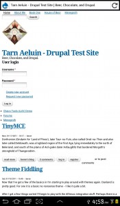
In the picture on the right you can see that straight off I made a big mistake. This large graphics cannot be scaled properly so my android tablet UI is all messed up a graphic larger that the smallest possible screen is probably not such a great idea. RTFM Beren! Or in this case UTFTBC (use the @#$#@ tool before complaining). On the good side you can see that the site is otherwise scaled right – the padding on the left edge is about the same relative size and fonts are ok.
I see on my tablet as I rotate between landscape and portrait that the sidebar is properly moving. That’s pretty cool. If I login on the tablet I see the debug regions, but the columns are not coming up – I’m using Firefox for Android.
Omega’s Grid Settings
The notes on the settings screen are a bit spare and assume a lot. I can see a lot of newbie’s giving up. I almost did, but it was rainy today so I had else to do except things I should be doing instead. Anyway – responsive settings are the first block in the tools. There’s Initial scale, minimum scale, maximum scale. The point of these three numbers are to setup an initial scale for your site and then limit how much a user can zoom in or out. So if your site sucks – like mine – 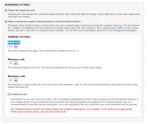 my users on a mobile device can zoom in or out if I want them to, but the defaults do not allow for this since you site should be perfectly usable on all devices, right? I suppose – but I sometimes like to zoom in even when the mobile site is usable anyway – so I changed that one to 3. No a user can use a gesture to zoom in 3X.
Zone and Region Configuration
The next interesting page to play around with is the zone and region configuration page. On this page you can control the section in which zones appear, the primary region, and then which are drawn on the page. Within each zone you can then play with the position of each component on the page using settings for columns widths of the component and also spacing before and after horizontally.
It is a a bit confusing really and there isn’t a lot of clarification that I can find anywhere. Part of the confusion is that there are block settings over under structure – and these seems to effect omega, but then there are other settings under site configuration that do not. So if you turn on a sidebar in blocks, will it show up in Omega’s settings – from what I can tell “sometimes”. From the blocks screen if you move a block to a region and then click “configure” you can see where it should be showing up in your Omega sub-theme – or you can turn it off. With all that done – here’s my site. I’ve got things generally in the right order. I switched to a smaller logo – I got the basic menus and tabs in the general places I want. However there’s a lot of subtle alignment and sizing things that I would like to fix up. the side-bar is way too wide, the primary menu, sitename, site slogan, and the articles don’t line up either. What’s a guy to do?
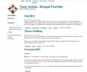
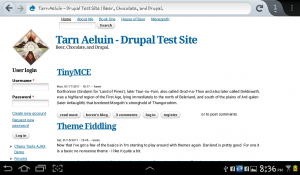
Here’s side by side of my web site on a widescreen laptop and a Tab 2+ android tablet:
Needs some work 🙂
Finally – Figuring out How to CSS Tune Omega
Disclaimers first – I have no idea if I’m following “best practice” , but maybe this might help you if you are struggling the way I did. I’ll keep updating this as I learn and refine. For starters definitely use both Firebug and Chrome’s built in CSS inspector. Very handy. What I’ve noticed is that there are a ton of classes, but most/many are defined in drupal/themes/omega/alpha/css/grid/alpha_default/narrow/alpha-default-narrow-12.css so they get over-ridden. This one had me stumped for a long time – what is this stupid thing that is screwing me up? Its the main CSS magic for the responsive stuff. Don’t mess. Instead if you need to tweak use the IDs. Everything has an ID too – it seems like you are meant to use those to tweak positioning and stuff.
Here’s a couple of examples:
#region-sidebar-first
{
width:132px;
}
#block-user-login ul
{
margin-left: -20px;
}
These take the sidebar, make it thinner, and also get rid of the indenting in the login “create new account” and “request new password” functions. I’ll just keep at this for a while I guess. Its pretty slow going.
For now I will publish since it is time for dinner and its Labor Day. More later…

