MacBook Pro 2016 Reaction and Setup
My MacBook Pro 2016 reaction and setup for development is a key milestone. A new machine, lighter, refined, with a very slim set of ports and connections. This is my fourth MacBook Pro, starting with the big 17″ unit about 6 years ago. This model promises much better graphics, a new keyboard, monster trackpad, and of course all those dongles we love. So how is the new machine and how do we set it up as a development machine? Read on!
Checking out the MacBook Pro 2016 Hardware
My outgoing MBP was a mid-2014 Retina 2.8 GHz with 16 GB of RAM and the NVIDIA Geforce GT card. My new machine is
 the top of the line MacBook Pro 2016 2.9 GHz I7 Core with 16 GB of RAM, 2TB SSD, and the Radeon graphics card. Slick.
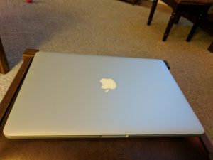
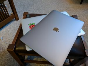
The MacBook Pro 2016 is lighter, slimmer, and slighter smaller than the old model. The bezel around the screen is about 50% of the size of the old one. I have the new dark grey color. Its pretty slick, but the Apple does not light up at all. Boo.
Before starting with the MacBook Pro 2016 machine, I’ll say that my outgoing machine was really great. I’ve had it for 3 years and it has really performed. We’ve had a few rocky issues, but all in all it is a great machine. I’ve also taken very good care of it – thanks to my granddad for teaching me to take care of my tools. No scratches on the screen or case. All stickers removed with 91% Isopropyl alcohol.
Basics of Software
I’ll first get a bunch of productivity software installed including:
- Chrome
- Firefox Developer Edition
- Sublime Text
- XCode and XCode command line tools – now I have git!
- Thunderbird for email access to my various email accounts
- Don’t forget to grab local folders (if you crated them) from your /users/username/LibraryThunderbird/… directory
- Box.com – simple and easy file synch from one machine to another
Basic macOS Configuration on a MacBook Pro 2016
- Put the screen lock back on the menu bar so you don’t get “fat catted” by a friend.
- Go into Keychain Access and then get into the Preferences to enable the lock icon.
- Go into Security and Privacy if you want to add a custom lock message.
- Add a custom login screen image by dropping an image into /Library/Caches
- The image must match your screen resolution
Setting up a MacBook Pro 2016 for Development
I’ve written a new post on setting up macOS for software development and merged the content from this section into that page.
Reactions to the New MacBook Pro 2016
 I got the space grey MacBook Pro 2016 unit and I do like the color, but it would have been cool to still have some kind of glow with the apple logo on the case. It is slightly smaller, thinner, and lighter than the outgoing model. As with previous model the machine is beautiful and sleek. It literally oozes quality and refined engineering. My machine has the Radeon top of the line graphics card. Performance is noticeably better than my outgoing machine.
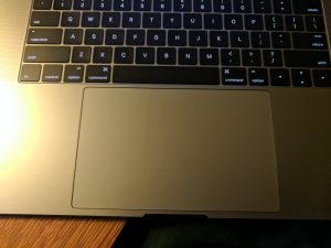
The keyboard has drawn a lot of criticism, but I think I really like it. It is different – but it makes a nice sound and it does have a nice tactile feel. Nice “clickety clack” going on as I type.The keys seems to be a bit out of place compared to my outgoing machine. I type a lot between messaging and coding (and writing). Its not a big deal, but it will certainly take a bit of getting used to. The keys seem to be a few millimeters different/smaller. I’m constantly hitting caps lock and colons.
The trackpad is freaking huge! Why? I guess I will get used to it, but I really don’t see why it is so big. Its big enough that I have  to very purposely hold my hands up in the air so that the heels of my hands to not touch it. Not great ergonomics for sure. I can feel my shoulders aching after working today on the machine from 6:30AM-6PM (short day today!). The click sensitivity and functions are adjustable in the preference panel so I’ll have to play around with those. The main pain point with the device is drag-n-drop. Sometimes you have something selected, but it won’t drag. Or you click too hard and it opens the preview view.
UPDATE 06/10/2017: I continue to be annoyed by the track pad and how it works. I also find that although I like the feel of the keyboard, my typing is still off due to the difference in overall width of the keys.
Ports and thus dongles…sigh. Why Apple? I can see getting rid of some things, but really? Not a single USB-A style? No SD? That’s the one that is most useful with my Fuji camera. The headphone jack makes the cut, ironic since the iPhone chopped that one. There are some good dongle kits, but I think I just need an HDMI out and a C-A converter. I’ll just get some cables. I see on Amazon there is an SD card dongle too. Maybe I’ll get that.
 There’s been a lot of back and forth about battery life. So far (2 days) in mixed use, battery life seems to be pretty decent. Its a little hard to tell since Apple has removed the indicators of power consumption – you cannot see what the current % charge left is.You can turn on the % thing by going into the Energy Saver settings. If you click on the battery it will also tell you which apps are using the most power – that’s pretty nice. It will also tell you how long until a charge is complete.
Authentication with the fingerprint reader is really nice. It does not work on the command line (terminal), but for all other admin privs, using the scanner is pretty nice.
The “menu bar” – well…so far I like it.The function keys are gone and replaced by a new icon strip that changes based on what you are doing. By default there are not too many icons displayed One tap and you get all the buttons you had physically on the previous machine. I like this and will have to learn about how to customize it. I want to get rid of the stupid Siri button. Its too close to the fingerprint scanner and I keep hitting it. Its pretty easy to do this from the Keyboard settings control panel. To put an icon on the menu bar drag it down off-screen and the bar will highlight. To get rid of something (like the Siri icon) do the opposite. Move the mouse point down off-screen and click and drag it back up. Works, but not intuitive.
UPDATE 04/21/2017: I’ve got the dreaded “menu-bar popping sound” issue. It started about 3 weeks ago. Every 20-45 minutes I’ll hear a pop sound from the machine. Its hard to tell where the sound is actually coming from (the menu bar itself or the speakers). There’s no consensus about potential harm from this problem.
Overall Impressions of the 2016 MacBook Pro
Overall I’m pretty happy with the new machine. Its fast, battery life looks at least as good as the previous machine, and the CPU and graphics are faster. It is smaller and lighter. The display seems crisper. Pretty nice if you ask me. Dongle are a PITA, but ok – one ding. Well see how it goes with the new MacBook Pro 2016.
I’ll update this post as I learn more about the MacBook Pro 2016 and its pros and cons. Now I’m off to get some stickers.


