Working with Drupal Themes Pt. 5 – the finale!
Rendezvous with Delta Squad we must. Upon them, we rest much hope.
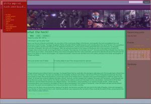
Well much progress in my Drupal theme has been made. I scrapped what I had before (see Working with Drupal Themes Pt. 4) and completely redesigned how the main template is structured. I’m not sure how to show this, but here’s a shot of the layout. I color coded the major areas of the interface. I still maintained a basic table structure and then within the major table regions I used CSS positioning and styles to get everything right. The image to shows how I broke up the table. The different colors show how the main table is constructed. Each color is a table column or row.
The table built in this way allows for some pretty cool features:
- I can have an unlimited width where the troopers “slide” under the left sidebar:
- I can allow the left “navigation” and right sidebar column to get very long without changing/effecting the other columns
- It is much easier to align the header files with the trooper images.
This is a different layout than I used with Plone, but I think this is better. The difference is that I made the left sidebar a full column. With the first version I had a main table row the header going all the way across the page. I didn’t like that and I had some trouble with positioning. I like this much better and will probably go back and make my Plone skin work the same.
I still have a bit of work to do however. The primary and secondary links need to get added to the purple row in the header and I do not like the right sidebar layout and styling. With the primary ans secondary links, I’m not quite certain how to arrange these. I need more experience with creating Drupal sites I think. I moved the links around, but I still don’t really like it. What I think I’ll do is create some kind of sidebar “navigation” widget for these. Here’s a screen shot of what I did – it does show that you can move around the links with no issues:
The sidebars are the next challenge. The trouble is because the zen sidebars assume that you will have a single color background on the whole page – in other words the sidebar styles are the same as used in the main content area. This is no good. I have to create a bunch of new styles to deal with this. This isn’t hard, just time consuming. I’ve already created some new styles and removed others. If you look at the left sidebar, my login name is green since this is the default “h2” color choice. So what I need to do is create a new style:
.leftSidebar h2 {
color: ffffff;
}
Now I’ll be good to go. I’ll continue to tune this skin in this way, but essentially it is done. I’ll also have to play around with how the primary and secondary links are displayed, but I need to add a lot more content and see how that goes. I hope you’ve enjoyed my series on Drupal skinning. If you missed an episode, here’s a set of links to all of them:


When you wish to create some theme, sometimes could be better to start with existing one, and to make modification.
A good choice for “base” drupal theme could be Zen drupal theme (project http://drupal.org/project/zen and demo http://themegarden.org/drupal50/?q=node&theme=zen )
Thanks for your comment!
I totally agree. My troopers theme is based on zen as are all of my theme articles for Drupal. Zen is the best theme to start from since it has all the basics and enough comments to help you see what’s going on.
For me this was good and bad since my theme is structurally quite different from zen. I do intend to return again to my theme and look at a pure CSS theme with no tables, but right now I was having huge problems with cross-browser compatibility so I gave up.
I would post the theme to drupal.org, but I’m afraid of a lawsuit from LucasArts. 🙁
Before I revisit my troopers theme, I’m going to look at creating a “Saab Turbo-X” theme…I just got a decent shot of the turbo unit so I’m all set to start this.
beren