Graphics, UI, and Fun with Appcelerator ATS
In my previous posts I’ve looked at getting started and then at the basics of UI, events, and some side notes on the practical side of working with Android devices:
- Appcelerator Titanium Studio – Mobile Development Made Easy?
- Layout and Design with Appcelerator Titanium
In this post I’ll bite the bullet and pull out my Macbook and see how all of this works with it. I suppose I can get out a Fedora machine, but one things at a time. I would also like to work thru some graphics and some more advanced concepts with UI, components, and events.
Configuring the Mac
First thing to do is go get a whole bunch of things: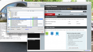
- Latest Eclipse Juno
- The Android SDK and all the necessary revs (2.2, 3.2 4.0, 4,1)
- Titanium Studio for Mac
- The Eclipse ADK plugin (optional for when I eventually compare ATS vs. native development)
- You’ll need a JRE, but the ATS install for MAc will add this automatically.
Well that’s a whole bunch of stuff – go grab 4 beers and watch the Tour de France as it enters the Pyrenees (15-Jul-2012). It will take a while. With all that done its time to build a sample app to a simple device – I have a Samsung Nexus S and an iPhone A1332 (but I need a SIM card this one – will have to scramble around for that).
After the downloads (and watching the amazing number of flats in the tour – tacks in the road!) I built a test app and got it deploying from Eclipse to the 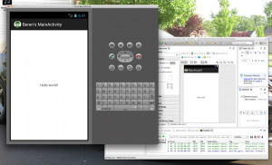 emulator and to my physical phone. Pretty easy (kinda) or I should say as easy as it is on Winbloze. Was pretty darn slow on the Mac getting the emulator going, but it did work. It also seemed to work ok deploying to my android phone from the Mac. I guess some of the emulators ain’t zippy fast on the PC either.
Since I’ll be building a bunch of apps, I’ll first need to stat working on graphics sets – a good place to start is a set of splash screens and app icons. If you look in your android project, graphics and other media resources go in – resources. Yes, not too difficult. Titanium puts in sample screens for you. I simply grabbed the structure out and used Photoshop to make a 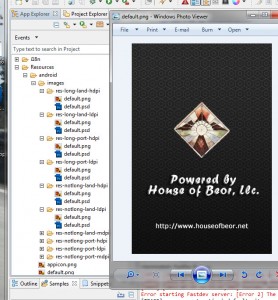 representative set for me – then save these out as a zip file and you will be go to go for all your apps. I created the following sizes and pixel densities:
- 320×480 @ 240.005
- 400×240 @ 119.99
- 480×800 @ 240.005
- 240X400 @ 119.99
- 800 X 480 @ 240.005
- 320 X 240 @ 119.99
- 480 X 320 @ 159.995
- 480 X 800 @ 240.005
- 240 X 320 @ 119.99
- 320 X 480 @ 159.995
Later on in the dev cycle I would clean out those PSD files – and I’m sure there is some genius that could figure out how to generate all the graphics from a single PSD source file, but not me 🙂 This is another spot where iOS is different – you have to manage all these things via iTunes. I’ll have to mess around with that later. I did have some sporadic problems with the icon not showing up properly – not sure yet what’s causing that (UPDATE: To solve the icon thing just delete the app from the device and you are good to go).
More Advanced UI Components
So far I’ve only played around with a few simple UI components. Table Views are a more sophisticated component that you see used in a lot of apps and even in most of the configuration screens for phones and tablets. This juncture requires a re-visit of the layout options – they are crude, but keep in mind the screens are small and simple, check these pages:
- http://docs.appcelerator.com/titanium/2.1/index.html#!/guide/Layouts,_Positioning,_and_the_View_Hierarchy
- http://docs.appcelerator.com/titanium/2.1/index.html#!/guide/UI_Composite_Layout_Behavior_Spec
The TableView component has a ton of features – there’s a sample app in the docs, but like all of the samples it does not use the application structure pumped out by the Eclipse templates. I started messing around with this, but really this is where ATS has some issues:
- All the examples use arrays inside a call to create something like a label. When done this way, Eclipse provides no helpers for what the possible parameters could be so you have to flip back and forth to the docs.
- Similar to the above – if you are passing objects to functions, ATS will not provide help for the parameters in the object – you need to know what they are. _params.???? – kind of a PITA.
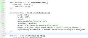
- ATS does not do a good job of identifying compile time errors. This forces a round trip to the emulator – quite a
 time killer, see the image to the right where there is a clear error in a variable name (searchbar vs. serchbar) that is not picked by the editor. Not too good. There is also no property “searchbar” – it is search – the IDE does not identify either as an error.
 - It seems to me that the way that code is written is fairly old school procedural – not object oriented – now this could be simply the tutorials, but it seems that any app of reasonable complexity is going to be a vast sea of partially coagulated stuff. I’ll have to look at the “reference apps”, but it would be better if the tutorials reinforced the proper way to build good code.
- ATS seems to have a mind of its own for when it will help out with sticking a semi-colon on the end of a snippet of code. It should either do it always or never.
To build my TableView example, create a new single window application using the Eclipse wizard. I added a couple of labels in FirstView.js (this is the file that is referenced from the main app.js file once you work thru the various startup tests) to be sure things are working properly:
    var label = Ti.UI.createLabel({
        color:'#000000',
        text:String.format(L('welcome'),'House of Beor'),
        top: '5dp',
        center: '150dp'
    });
    self.add(label);

    var label2 = Ti.UI.createLabel({
        color:'#000000',
        text:String.format(L('beren')),
        top: '40dp',
        center: '150dp'
    });
Make sure that launches to either an emulator or a device. Now we know where to add our crap – um I mean components:
     var myTableView = Ti.UI.createTableView({
            width:'90%',
            height:'85%',
            top:60,
            backgroundColor:'transparent',
            separatorStyle:Titanium.UI.iPhone.TableViewSeparatorStyle.SINGLE_LINE
    });

    var row = Ti.UI.createTableViewRow({
        backgroundColor:'transparent',
        height:74
    });
Some labels to the row:
    var primaryLabel = Ti.UI.createLabel({
        text:'This is a great row!',
        font:{
            fontSize:16,
            fontWeight:'bold'
        },
        color:'black',
        top:42,
        left:75,
        height:'auto'
    });

    var secondaryLabel = Ti.UI.createLabel({
        text:'Great rows are  born at House of Beor!',
        font:{
            fontSize:13,
            fontWeight:'bold'
        },
        color:'black',
        top:42,
        left:75,
        height:'auto'
    });
and finally add all of this to the UI:
row.add(primaryLabel); row.add(secondaryLabel); var tblData = []; tblData.push(row); myTableView.setData(tblData);self.add(label); self.add(label2);
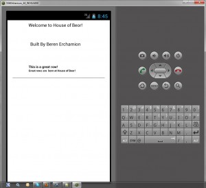
You should be good to go – try launching that (here’s a copy of my FirstView). If you get errors carefully look for null pointers and such in the console output. You should get something that looks like this –>
One thing that is really helping me to learn this tool is – don’t just use the examples. Download them and look at them, but make new programs from eclipse and either cut/paste from the download or just type them for yourself.
I re-worked the TableView example using the ATS generated tabbed window structure. Seemed to work ok – basically if you just enter all your logic into either a seprate JS file or into the ApplicationWindow.js file – this seems to work, but hold on! Look what I found:
http://developer.appcelerator.com/blog/2012/02/building-the-community-app.html
Looks like a good start at a reference, but then it kinda stops and there’s been no activity since. Too bad. I did find more explanation about this project here deep in the documentation:
http://docs.appcelerator.com/titanium/2.1/index.html#!/guide/Community_app
Then I found this as well:
https://wiki.appcelerator.org/display/td/TCMD+Course+Labs
Well I hope this series of articles is helping you to learn this tool. At the least for me its a good aggregation of links to things that are helpful. I’ll be working on a few more things in my next post – other more advanced components, trying to figure out better architectures (or at least how to chop up code into reusable pieces), and finally a comparison of development between ADK and ATS.



If ur serious about this tool – one thing that is becoming obvious: a wire framing tool or graphics tool with pixel layout is critical. Round tripping this kind of screen design in ATS is not workable. Balsamiq is a good tool – but it is not a pixel tool. Suggestions?
It does also seem like there is a lot of baggage in these apps. The basic single view app template deployed to a device consumes 16MB of space. That’s pretty darn big. A similar droid app built with the ADK is about 600KB.
Seems like kind of a hassle to lay out an interface like this. You are definitely right that using a graphics tool would be requried if there’s no GUI designer in the tool.