Drupal 7.15 and Omega Theming
Now that I have Drupal 7.15 working again locally I will be playing around with themes, in particular themes that support responsive features for layout control with device screen dimension differences. Responsive themes basically have a screen media querying capability and a set of resources (CSS, JS, images) that can be dynamically changed to support screens on laptops, phones, tablets, etc.. Not rocket science, but definitely something that in today’s world is required.
Omega
I looked around on Drupal for themes and came across Omega. This theme looks like a good place to start. It has responsive built in, is meant to be sub-themed, it is widely used and actively maintained, it has a Drupal 8 module started already, and it has great documentation. It definitely takes work to get Omega installed – there are a bunch of module dependencies, but the instructions worked on my config (Win7-64, apache 2, PHP 5.3, MySQL).
Once installed there’s a new menu to install an omega sub-theme. Do that and go into the settings. I walked thru most of the handbook pages, but of course I always have to mess around and break crap. One thing I noticed is that if you  switch from the 960x grid to fluid the 12 column overlay disappears so if you did that and you are scratching your head trying to figure pout what you broke (like I did), just go back to 960x and it will re-appear.
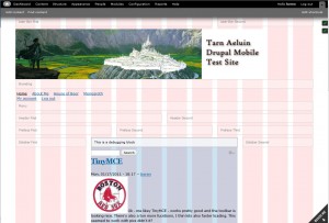
In the shot to the right I’m logged in so I can see all the debug stuff. Its easy in the settings to turn them off for a  non-authenticated user. That’s what I did. I can then browse the site and see the real layout in Chrome.
As you can see, I’ll be creating a theme around the banner in the images – the city of Gondolin from the second age of middle-earth is the city in the picture in case you are curious. I used PHOTOCOPA to generate a set of colors from the image. Pretty cool app if you have not heard of it.
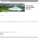
The next thing you need to do is create some content. You need content before you can see how your layout will work. I’m going to add some book pages, a few regular pages, a footer, and a forum and some messages. After I  get done with that I will use the regular Drupal admin pages to add things to the regions using the normal admin tools. I’m also going to turn off some display things that I don’t need or want. After messing around with blocks and some content, my site looks like the image to the right.
Sections, Zones, Regions, Blocks
What, what , what? Uh – even here the docs are pretty weak trying to explain this. Read them all, but experimenting is the only way to go. I won’t pretend to get it all, but you can move things around in relative order by playing in the Appearance settings area’s weights. I want my main menu above the banner – I set its weight to 1, and the branding area weight is 2. Hit re-load and there yo go – it is moved. Interesting….
I also did create a new block for a footer – this also required me to add some new styles to the global.css file located in my sub-theme’s CSS folder. Global.css is loaded for all screen sizes so its the place to put things like this. Just add a block – use the HTML function, include some styles. Then add the block to either footer 1 or footer 2. Then add some styles to the CSS file – bingo. Later I’ll update the CSS with my colors.
Getting Down with CSS
Now that I have most of the basics configured it is time to get the CSS tuned for the layout I want. Global.css is the main file you want to mess around with at first. This file will be referenced with all screen sizes. For changes and settings specific to a subset of screen sizes you want to put those settings in other CSS files as described in the docs. I’ve added a bunch of footter CSS tags to my global CSS file and a few other global CSS changes – for example I would like a very narrow magin on the left side of my page. All of my font and basics colors for links and stuff also went into global.css.
I’m trying to get some of the CSS settings to work, but having troubles. When I add CSS to the default files added it gets over-ridden by the CSS from the main module. Not sure why this is. Will have to investigate more. I do see some things in global.css seem to be ok, but general layout things like padding of the main page (I would like left aligned) do not.
Well this is a pretty good start I think. I’ll be adding a second post with an update on how its going with the CSS implementation.


