We’re getting down to the design aspects now – colors and textures are pretty important. We have one window letting in some natural light. We also have the big screen to think about and how ambient light will impact things. In general we are also still going with our craftsman theme/style.
We have a pretty complex set of textures. Oak cabinets, carpeting, stone, and the large couch. The counter tops, while polished granite, also contribute to this. As a design goal we wanted to keep things simple. We wanted the focus in the room to be on the cabinets, stone, and the screen. We also don’t want people to get overwhelmed with too much going on.
Floors: Type and Colors
Along with all of this we want a design that is easy to maintain and keep clean. We decided to start with the carpet and expand from there. The main carpet we picked is a neutral tone (white asparagus) carpet from Mohawk.
The line is the SmartStrand Silk. Very soft and with a slight dimple texture – easy to clean and shampoo. Excellent wear ratings and anti-stain stuff. Here’s a closeup next to the home theater cabinets. Looks great!
We decided that the exercise room needed a different flooring. Since I plan I doing “dojo stuff” in there I opted for a wood floor. I’ll also have a treadmill and bike in there too so a hard surface is better. Also easier to keep clean because I sweat like a pig.
We looked around at a lot of wood products. The problem was that we have all this wood oak cabinetry – so along with being “wood overload” we were worried that we would not get a good match between the color of the floor and the color of the cabinets. We looked also at vinyl, cork, and porcelain products. We weren’t happy with them:
- Vinyl also was too close to oak
- Cork absorbs water and placing a treadmill on it is no good – it will dent and tear.
- Porcelain is no good for jumping around on.
Then we saw some samples of stranded bamboo and decided that was pretty cool:
- Its hard as heck and great for equipment and jumping on.
- Its easy to maintain and keep clean
- It looks very different from oak
- Its a “green” product – although I’m sure they burn a crap of gas harvesting bamboo and making the crap.
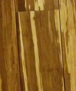
We decided to go for Teragren’s Synergy Stranded bamboo in “brindle” coloring. I think that’s pretty cool looking stuff – but it ain’t cheap.
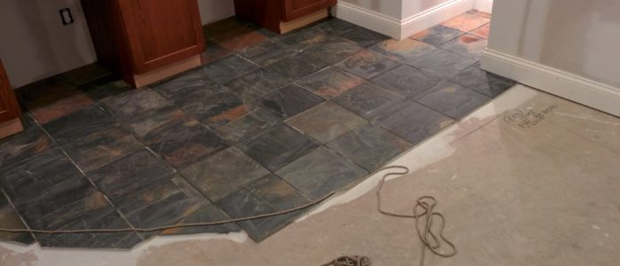
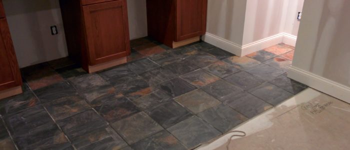
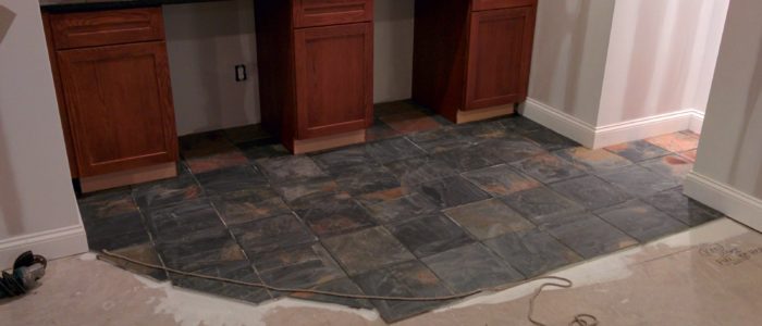
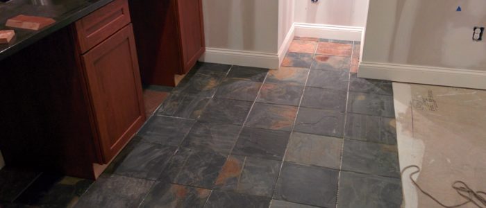
In front of the bar we needed something like tile, but we couldn’t find a tile that worked. With stone behind the bar and granite counters, adding another thing just seemed no good. We wanted something simple and dark. On the way out of the store I noticed some slate stones. Right away I knew that would work great. Its dark and has a very minimal color pattern to it, but it is rough and bumpy. So in front of the bar and the beer grotto we will have a small slate “patio”.
Finally the slate is in – still needs some sealing and grout work, but it already looks fantastic!
The rope is showing how we’ll cut an arc along the edge. It is hard to tell from the pics, but the slate provides a very rough and textured feeling – a nice contrast with the wood and granite. It took 3 weeks to get this stuff – so I’m really glad it is in as it was holding up everything.
We need a break from all of this – so for the counter tops we are going with a very dark granite. This will separate the stone and above counter “action” with the floors. The granite we picked is Black Pearl – we did consider a finish that was not completely polished (either honed or leathered), but in the end we took simple maintenance over looks.
Stone: Type and Colors
A big part of our basement is my idea around medieval history and the places in Europe I’ve been that have stayed with me – this includes De Pelgrom in Antwerp. We started with big stone ideas, but cost and overall the budget made us cut back. Still its a big theme for me. The Idea was to combine the feeling of old Antwerp with our life in New York (Bronx, Queens, and Manhattan) – so stone is a big part of that.
With that in mind here are some pics of the stone that is going in on the outer walls of the project to give the feeling of a deep basement space.

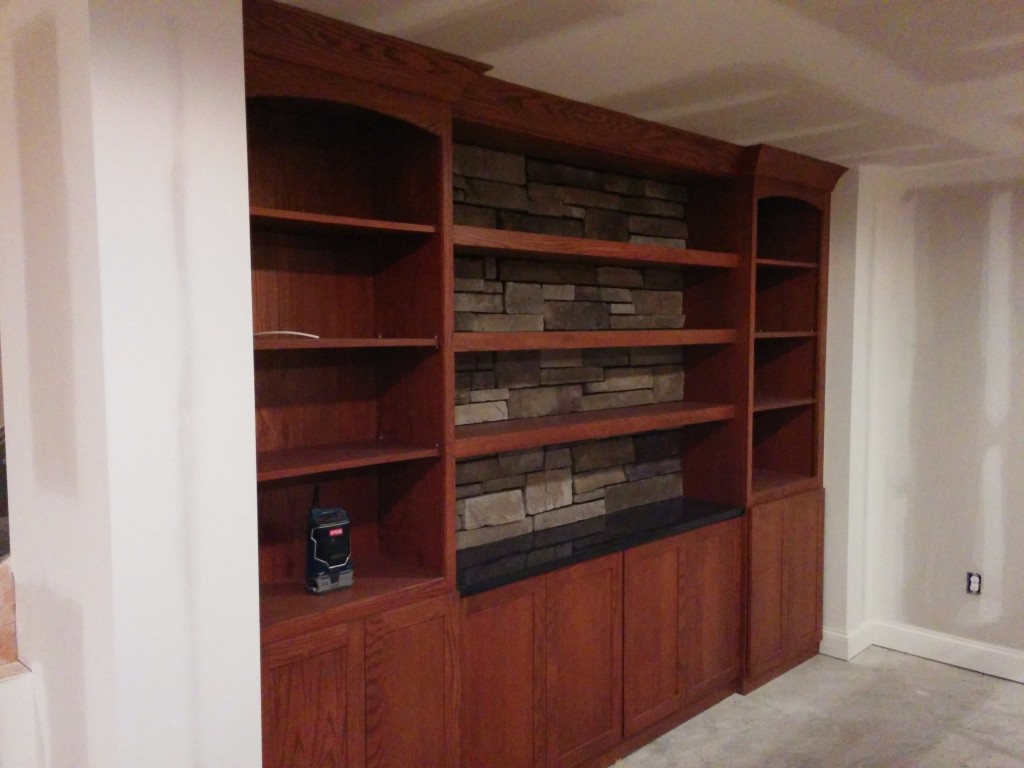
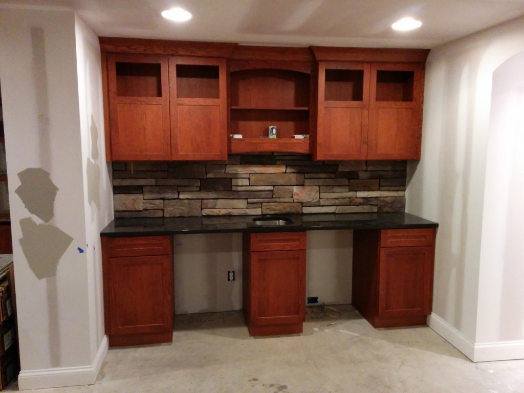
These “stones” are from Boral – cultured stone if you can believe that. Pretty good even up close. If you are ever in Antwerp – please go to De Pelgrom it is near the old cathedral. Good stuff there.
Paint: Wall and Trim Colors
Next up is wall colors – we’re going with Sherwin Williams paints. Great paints that cover well and are highly washable.
They also have some pretty decent mobile apps for android that help you do color matching and creating a set of matching colors. Don’t use Kitcat tho – argh! Had to use my son’s phone. Boo….but then it worked.
We’re going with a fairly muted palette. The walls in the main room will be SW 7638 Jogging Path, the exercise room is SW 6148 Wool Skein, the bathroom is SW 7662 Evening Shadow, and trim will be SW 70004 Snowbound:
Those should work nicely with the cabinets, stone, and the couch.
Here’s some pics of the finished product – pics are not really coming out good:


The best pic is of the exercise room. The color is slightly lighter than the main room. This creates an optical illusion that it is a larger room. Love the colors! Just like I imagined.


