Working with Drupal Themes Pt. 4
UPDATE: I’ve published 5 articles on theming with Drupal. This one is the fourth (thus the pt.4). Here’s the links to the others:
- Working with Drupal Themes Pt.1
- Working with Drupal Themes Pt.2
- Working with Drupal Themes Pt.3
- Working with Drupal Themes Pt. 5
Well I’ve been sidetracked for a while with a bunch of things. So after much ado here’s my Pt4 on messing around with Drupal themes. If you read my previous three posts you’ll know what I’m doing. If you didn’t just use the search at the bottom on “drupal themes”. In Part 3 I spilled the beans on my ultimate goal and what I want it to look like. So its time to “lock and load” and the Sev and the boys operational on my Drupal site.
First off I’ve yet again changed PHP developer tools and will be using the Aptana Studio tool for all my work on this. This is a great tool – if you don’t have it then stop reading this and read this instead. I’ll again say that I’m still fairly new with Drupal so there are probably things I’m not doing totally 100% correct, it’s just how I figured out how to get it done. If you have suggestions – please comment and I’ll update my post.
I’m going to take my theme and start to re-arrange the sections a bit. If you recall, my goal is to reproduce my favorite plone theme, based on the Republic Commando LucasArts game. To do this will require moving around a lot of the blocks and perhaps going to a tables based layout to get everything aligned properly. I have a basic set of colors to work with based on my graphics:
- Dark Brown: #5B1C13
- Dark Grey: #9199a4
- Yellow: #DBDD41
- Green: #154D20
- Purple: #2F0035
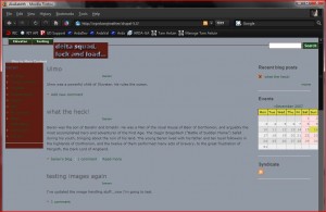
Sounds nasty, but these are all lifted from the game. I’ve applied these colors to my skin in the zen.css from a first go around and here’s what I have now:
As you see see I’ve got some colors (and color problems) and I’ve messed up placement of things by chopping around in page.tpl.php. What I’m going to do is experiment with moving div blocks around to see how much I can do just with that. Then I’ll play around with CSS placements using Firebug. Be sure to either use svn or take zip files regularly of the theme directory so that if you completely screw something up you can recover from a last good point.
Once you start messing around a lot with Drupal’s CSS tags and files it becomes a bit confusing to keep track of what is where. What I decided to do is put anything I’m changing in the zen.css file at the top with a big comment block around it. This way I know for 100% sure which file I need to maintain and where I made changes. The first thing to get straight is the colors. I’m going thru all the colors and adjusting them for good visibility. The other thing to check for is duplication. You can use Firebug to see where a tag is getting set with the same value twice and eliminate this. This will speed up your rendering, but be a little careful because sometimes the duplication is on purpose. It takes a lot of testing and fiddling around. A great activity on a snowy afternoon with a six of Smuttynose 🙂
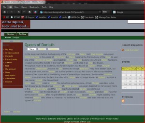
Here’s what I have now in my theme:
You can see that I’ve played with colors and added some additional pieces for secondary and primary links. I’ve also added in a div for the trooper pics. Now my task is to figure out how to include new images referenced from my theme’s image directory. Right now the div is not working so I get just black. Once I get the image to show up then I can position it. Off to google…
From what I figured out there are two ways to get a path to your image:
<img src=”./themes/zen/images/commando_r.jpg”>
This is horrible because of have the url completely hard-coded
<img src=”<?php print base_path() . drupal_get_path(‘theme’, ‘zen’) .’/images/commando_r.jpg’ ?>”>
This is a little better, but not much. Surely there must be a better way, but for now I guess this will do. I’m going to use the second form since it is slightly better I think. I got a response to a forum post on Drupal.org for how to get the path to your theme using path_to_theme() API call.
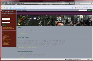
I’ve spent quite a bit of time re-arranging everything in my template. I still have a ton of work to do, but I think its finally at least starting to look ok. I have some odd little lines on firefox, but IE is looking decent. Here’s a shot of what it looks like now:
I was hoping I could finish in this post, but I still have to do a lot of work…sigh. I need to add back in the footer region, primary links and secondary links. breadcrumbs, and a number of other things. So I guess there will be a part 5. Plus I am probably doing a hack job of this. Part of my theme is now using tables for helping with placement of stuff. That’s a cheat…eventually I’ll have to fix that. I have some days off for the holidays. I guess I’ll need to follow up quickly or I will forget what I’m doing.


What happens if I upgrade to a new version of Drupal?
(edited by admin to remove advertisement)
An ad? Lame dude…